How Waypoint works
A walkthrough of every screen and control — from getting an account to reading a score to generating a client brief.
Getting started
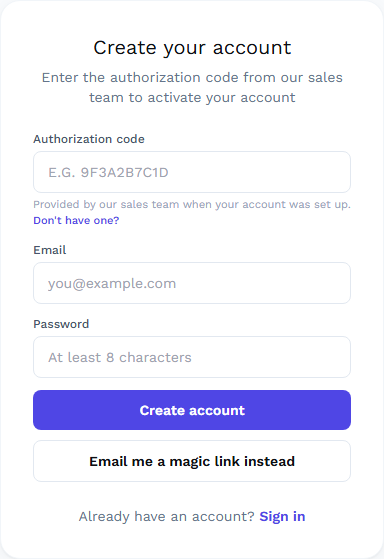
Waypoint has no self-serve signup — accounts are set up with a Reliable Analytics team member so seats are tied to the right licensed agents from day one.
- 1
Pick a plan
Review Founding Agent, Solo, Team, and Brokerage on the Pricing page and request access.
See plans → - 2
Get your code
After a short setup call, we create your account and hand you a one-time authorization code.
- 3
Create your login
Enter the code on Sign up. It activates your seat automatically — no separate approval step.
Go to sign up →
Already have a code but no login yet? Create your account. Already signed up? Sign in.
Choosing your lens
Every area — neighborhood, ZIP code, or city — is scored four separate ways from the same underlying data, using the same mechanism at every geographic level. The Opportunity lens control at the top of the dashboard switches which one drives the table's ranking, coloring, and the Top Opportunities panel.

Buyer
A high Buyer score means a neighborhood currently favors the purchaser. It rewards more active listings, longer days on market, sale prices landing below list, and softening price-per-square-foot. In plain terms: places where you are more likely to negotiate and less likely to face a bidding war.
Seller
A high Seller score means the neighborhood favors the homeowner listing today. It rewards strong competition, fast velocity, sale-to-list ratios at or above 100%, and a high share of homes selling above their list price. These are the markets where listing now tends to mean a quick sale near or over asking.
Investor
A high Investor score balances entry value against growth and exit risk. It rewards reasonable price-per-square-foot, year-over-year appreciation, liquidity (the ability to sell again), and underlying demand. It is built for someone buying to hold or flip rather than to live in.
Partner
A high Partner score points to where the business is — for an agent, lender, or vendor who needs steady deal flow. It rewards transaction volume, market stability, sustained activity, and listing velocity. It answers "where are the most transactions happening reliably?" rather than "is this a good buy?"
Reading the dashboard
Top to bottom, here's what each part of the dashboard does.
- Summary cards
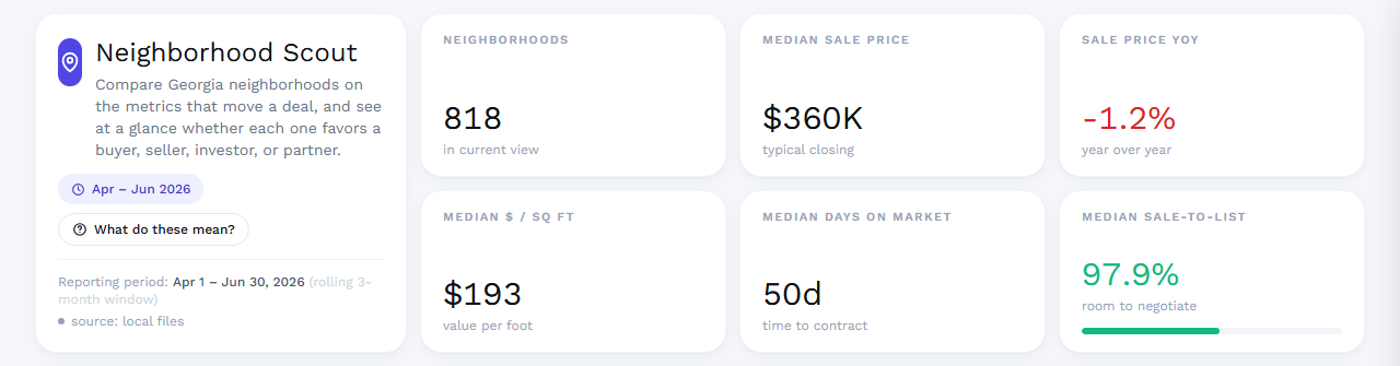
- Six cards next to the Waypoint header — how many areas are in view, median sale price and its year-over-year change, price per square foot, days on market, and sale-to-list ratio. On the unfiltered default view the five metric cards show one statewide Georgia baseline that stays the same across the Neighborhoods, ZIP Codes, and Cities views — the market itself doesn’t change just because the level of analysis does. Only the count card tracks the active view. Once you apply a filter, all the cards update live against your filtered results.
- Market view
- The Neighborhoods / ZIP Codes / Cities toggle flips the dashboard — Top Opportunities, filters, and the comps table — between the three geographic levels. Every level is scored by the same mechanism, so a top Buyer opportunity means the same thing whether it’s a neighborhood, a ZIP, or a city. The summary cards hold their statewide baseline when you switch (only the area count changes), your search and price filters carry over, and the city/metro dropdown resets because its values differ per level.
- Find an address’s market
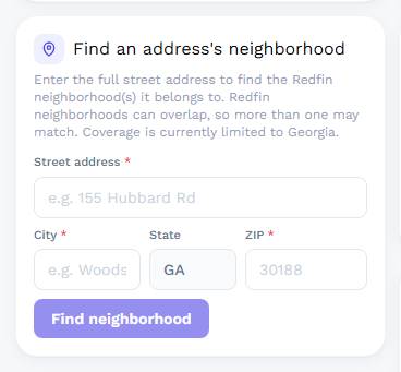
- Type a street address to see it three ways at once: its best Redfin neighborhood match (overlapping neighborhoods show every match), its ZIP code, and its city — in that order. Pick any of the three and the whole dashboard switches to that view and highlights the row. If a specific neighborhood can’t be confirmed, the nearest neighborhoods by location are offered, and the ZIP and city matches are always available as fallbacks.
- Filters & Parameters
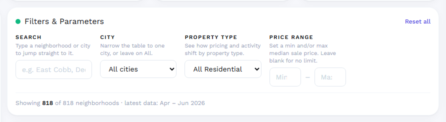
- Narrow the table by free-text search, city (or metro, in ZIP and city views), property type, or a min/max sale price band. Neighborhoods carry All Residential data; ZIP and city views also offer Single Family, Condo/Co-op, Multi-Family, and Townhouse. The result count updates live, and Reset all clears every filter in one click.
- Top Opportunities
- The eight highest-scoring areas in the current market view for the active lens, ranked as a bar chart. Click any bar to jump to and highlight that row in the table below.
- Comps table
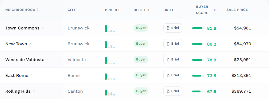
- Every neighborhood, ZIP, or city matching your filters, depending on the active market view. Click a column header to sort by it, use Columns to add measures grouped by Pricing, Activity, Demand, and Scores, and click a row’s name to open its live Redfin page in a new tab. Profile shows a four-bar glyph of all four scores at a glance, and Brief opens a client-ready summary for that row.
- What do these mean?
- The button in the dashboard header opens the full Metric Guide — plain-language definitions for every lens and every metric, plus a note on how to read year-over-year coloring.
Client briefs
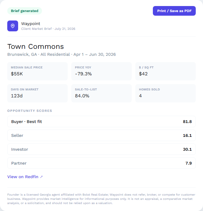
Click Brief on any row in the comps table to generate a client-ready one-page summary — key stats, all four opportunity scores with Best Fit called out, a link to the listing on Redfin, and the required licensure and non-appraisal disclosure. Use Print / Save as PDF to export it.
Briefs count against your plan's monthly allowance, shown at the top of the dashboard and again before you generate one. The counter resets at the start of each billing period and unused briefs don't carry over. Team and Brokerage plans are unmetered. If you run out before your next period starts, a Buy more link is offered for a single brief or a 10-pack, billed on your next invoice.
Exporting data
The Export CSV button above the table downloads the currently filtered and sorted result set as a spreadsheet. CSV export is included on the Brokerage plan; other plans see a locked version of the button linking to Pricing.
Understanding the metrics
Every measure available in the Columns chooser, grouped the same way it's grouped in the app. The same definitions are always one click away via "What do these mean?" inside the dashboard.
Pricing
- Median Sale Price
- The middle price of homes that actually sold last period — half sold for more, half for less. More stable than an average because one mansion will not skew it.
- Median List Price
- The middle asking price of homes on the market. Compare with sale price to see how far list and sold prices diverge.
- Sale Price YoY
- How much the median sale price changed versus the same period one year ago. Positive means prices rose.
- Price / Sq Ft
- Median price per square foot. The best apples-to-apples way to compare value across neighborhoods, because it strips out differences in home size.
- Price / Sq Ft YoY
- Year-over-year change in price per square foot — a cleaner appreciation signal than headline sale price.
Activity
- Homes Sold
- Number of homes that closed last period. A volume signal — more sales means more comparable data and a more liquid market.
- Homes Sold YoY
- Change in sales volume versus a year ago. Rising volume often signals warming demand.
- New Listings
- Homes newly put up for sale last period. Fresh supply coming onto the market.
- Active Listings
- Homes currently for sale. This is supply. More active listings relative to sales gives buyers leverage; scarce supply favors sellers.
- Active Listings YoY
- Change in supply versus a year ago. Growing inventory loosens the market; shrinking inventory tightens it.
- Days on Market
- The median number of days a home sits before going under contract. Lower means homes sell fast (hot, seller-friendly); higher means slower (more buyer leverage).
- Days on Market YoY
- Change in how fast homes sell versus a year ago, in days. Negative means homes are selling faster than last year.
Demand
- Sale-to-List
- Sale price divided by list price. Above 100% means homes typically sell over asking (bidding wars). Below 100% means there is room to negotiate down.
- % Sold Above List
- The share of homes that sold for more than their asking price. A direct read on bidding pressure.
- % Off Market < 2 Wks
- Share of homes that went under contract within two weeks of listing. A fast-twitch demand signal.
- % Price Drops
- Share of active listings that have cut their price. Rising price drops point to softening demand and buyer leverage.
Scores
- Buyer Score
- Opportunity score (0–100) for purchasing. Higher = more buyer-friendly conditions.
- Seller Score
- Opportunity score (0–100) for selling. Higher = more seller-friendly conditions.
- Investor Score
- Opportunity score (0–100) for investing. Higher = stronger blend of value, appreciation, and liquidity.
- Partner Score
- Opportunity score (0–100) for deal flow. Higher = more reliable transaction volume and activity.
Plans & billing
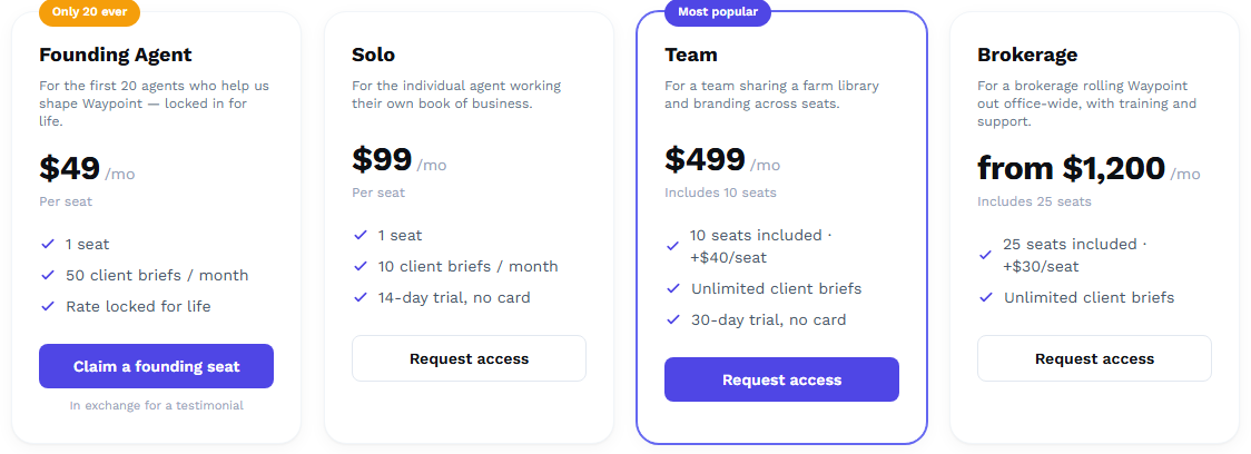
Founding Agent, Solo, Team, and Brokerage plans differ by seat count, monthly brief allowance, and features like team branding, shared farm libraries, usage reporting, and CSV export. There is no self-serve checkout on any plan — everything is set up on a call, trials never require a stored card, and cancellation on monthly plans takes effect at the end of the current period.
FAQ
- I don't have an authorization code. What do I do?
- Talk to our sales team — see plans on the Pricing page, or reach out via Contact. Once your account is set up, you'll get a one-time code to create your login at Sign up.
- What's the difference between the Neighborhoods, ZIP Codes, and Cities views?
- They are the same dashboard at three geographic granularities. Each level has its own Redfin market data and opportunity scores, but the scoring mechanism is identical — the four lens scores and Best Fit are computed the same way at every level, ranked against peers at that level. Use neighborhoods for street-level farming, ZIPs for mailer and ad targeting, and cities for a market-wide read. The address search can drop you into any of the three.
- What does "Best Fit" mean on a neighborhood?
- The lens where that neighborhood ranks highest relative to every other neighborhood, using percentile rank rather than raw score. A neighborhood can show a lower raw score for its Best Fit lens than for another lens in the same row — Best Fit is about what a place is most distinctive for, not which number is biggest. Open "What do these mean?" inside the dashboard for the full explanation with live percentiles.
- Why does the same neighborhood look different for buyers and sellers?
- Because the four scores measure different things from the same underlying data. A market can be great for a seller (fast sales, bidding wars) and tough for a buyer (little leverage, low inventory) at the same time — Waypoint scores both sides honestly rather than picking one "winner."
- How often is the data updated?
- Waypoint refreshes monthly. Each neighborhood's numbers cover a rolling three-month window, and the exact reporting period is always shown in the dashboard header and on every client brief.
- What if a neighborhood isn't showing up?
- Coverage spans 800+ Georgia neighborhoods, but very low-activity areas can be sparse in a given period. Try widening your price range or clearing filters — the result count in Filters & Parameters shows how many are currently excluded. If the neighborhood still isn't there, switch to the ZIP Codes view (or search the address and pick its ZIP match) — ZIP-level data covers areas too quiet to report at the neighborhood level.
Still stuck? Contact us — we read every message.